
KneeFlex static ads
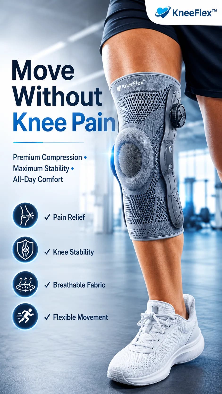
A pain relief headline, one close crop of the brace and four ticked benefits, built in square and vertical.
Overview.
KneeFlex is a compression knee brace. The ad has one problem to name and one product to show.
The headline names the problem in three lines. The brace takes the right half of the frame, cropped on a moving leg so it is shown in use, not on a shelf.
What was made.
- Square ad for the feed
- Vertical ad that extends the scene
- Four benefit icons
The work.
Design choices.
- The headline is set in three lines with the last two words, Knee Pain, in the brand blue. The problem is the loudest thing on the page.
- A soft, bright gym background keeps attention on the grey brace and the dial on its side.
- Four benefits sit in dark circular icons with ticks: pain relief, knee stability, breathable fabric, flexible movement.
- The vertical version is not a scaled copy. The scene runs further down to show the shoe, which gives the extra height something real to hold.
One layout, two sizes.
Both ads use the same left column of type and icons. Only the photograph changes, so the message reads the same wherever the ad is placed.
Delivery.
Delivered as two ads in two sizes: 1:1 and 9:16, as image files.
Formats.
NebuMist static ads
Send us the footage.
Or the brief, the idea, or the account that needs a hand.